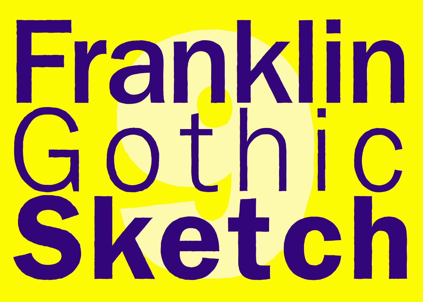
When type designers start a new font project, they start with drawing basic forms. Thereafter a couple of letters are put together to a word that contains most of the basic forms. These »sketches« decide if the idea for the new font is any good. »FRANKLIN GOTHIC SKETCH« has been left in that state. The font looks smooth in small sizes, in big sizes the edges show and give the glyphs a brute appearance, that makes this font special.
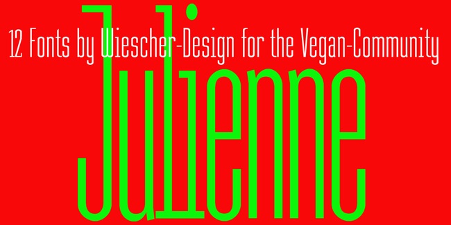
Cooks call thinly cut – like matchsticks – vegetables »JULIENNE«.
I found that was a fitting name for this very narrow typeface.
Julienne Slim is the extreme cut of the two. Personally I do not use narrow typefaces very often, but from time to time they come in handy if there is much text to be crammed into little space.
I could make a typeface that was even narrower, but I will not do it. This is as narrow as my typefaces get.


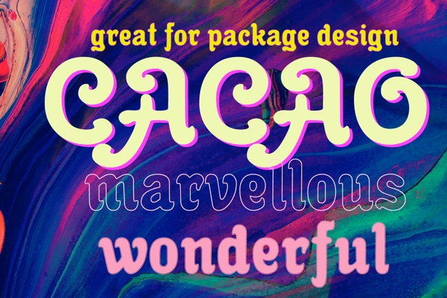
I am a enormous lover of cocoa, I will give you my recipe for a normal coffee mug full of delicious hot cocoa. Mix three heaped teaspoons of sugar with one and a half to two teaspoons of finest cocoa powder. Then add a little cold milk, stir, add a little cold milk, stir, and so on until you have a mushy creamy consistency. Now slowly add - always stirring - boiling hot water til the cup is almost full. Top with a little liquid cream and enjoy! If you have a package design job, use my »Cacao« font and stir in some creativity. Your sweet-tooth designer, Gert Wiescher. Enjoy! You get the best deal for the fonts if you click on the image above or on my funny face!